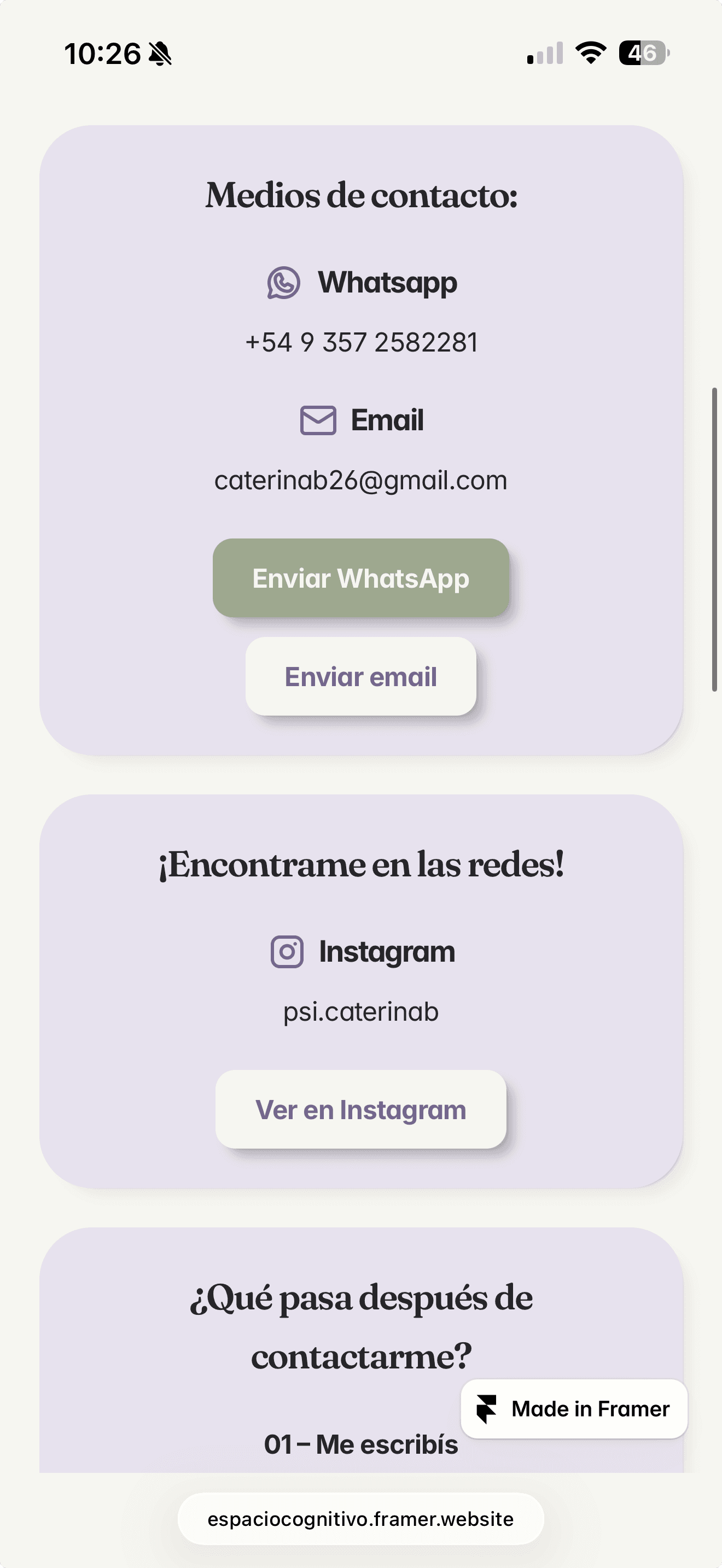
A warm digital experience designed to make therapy feel more approachable.
Client
Caterina Biondini - Psychologist
Industry
Psychology & Mental Health
Tools used
Figma - Adobe Photoshop & Illustrator - Blush - Framer
Services
UX Strategy · Information Architecture · UI Design · Framer Development

Summary
Espacio Cognitivo was created to give Caterina a professional digital presence where she could explain her services, therapeutic approach, and way of working with greater clarity.
Beyond presenting information, the website needed to reflect her personality and help prospective patients feel more comfortable before making contact. The goal was to create an experience that felt professional and evidence-based, while remaining warm, approachable, and genuinely human.
Looking for psychological support can come with uncertainty. Someone visiting the website may be trying to understand what they are experiencing, whether therapy is right for them, what type of support they need or simply what will happen if they decide to reach out.
The challenge was to communicate professional expertise without making the experience feel clinical or distant.
The website needed to balance several qualities at once: scientific credibility and human warmth, clarity and sensitivity, professionalism and approachability.
Above all, it needed to reduce unnecessary uncertainty around taking that first step.
The challenge
The solution
Designing around the questions people actually have
The experience was built around understanding both sides of the relationship: Caterina as a professional and the people considering reaching out to her.
Instead of starting with pages and visual styles, the website was structured around the questions prospective patients are most likely to ask. Who they will be speaking to, how therapy works, what support is available, and what happens after they make contact.
This gave the website a clearer purpose: not simply to describe the practice, but to help someone feel informed enough to take the next step.
Making the person behind the practice visible
Trust in psychological care is deeply connected to the person providing it.
Rather than keeping the professional behind generic service descriptions, the website gives Caterina a strong presence throughout the experience. Her background, approach and way of working are communicated in accessible language, helping visitors understand both her professional perspective and the person they would actually be speaking with.
Using first-person language also reinforces that direct relationship and avoids making an independent practice feel like a larger institution.


Creating a more predictable path towards therapy
Uncertainty around the process itself can create unnecessary friction.
The website explains how therapy works, what someone can expect and what happens after they get in touch. Important information is introduced progressively so visitors can explore at their own pace without being overwhelmed.
This creates a clearer journey from curiosity to understanding and, eventually, contact.


Helpful information without becoming a traditional blog
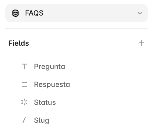
A CMS-driven resource library was created to give Caterina a place to share carefully selected external material related to psychology and mental health.
Rather than positioning her as a content publisher, the resource section acts as an extension of the practice: a curated collection of evidence-based information visitors can explore when useful.
A separate FAQ system addresses common practical questions about therapy and the process, helping resolve smaller uncertainties before someone needs to ask them directly.
Balancing scientific credibility with human warmth
The visual identity needed to communicate expertise without falling into a cold clinical aesthetic, while also avoiding the generic wellness imagery commonly associated with mental health websites.
The resulting direction combines:
Warm neutral backgrounds
Plum and sage tones
Editorial typography
Friendly illustration
Generous spacing
A calm visual rhythm
Fraunces introduces warmth and personality, while Inter keeps practical information clear and accessible.
Illustration was used instead of generic stock photography to support the more personal, approachable character of the practice.


Evolving an identity that already meant something
Caterina already had a logo originally created around a physical business card she intended to continue using.
Rather than replacing it completely, the existing mark was refined and adapted into the broader digital identity. This retained familiarity while creating a more cohesive visual system around it for the website.
The goal wasn’t to create a completely different brand, but to give the existing identity the structure it needed to work digitally.

Original physical card
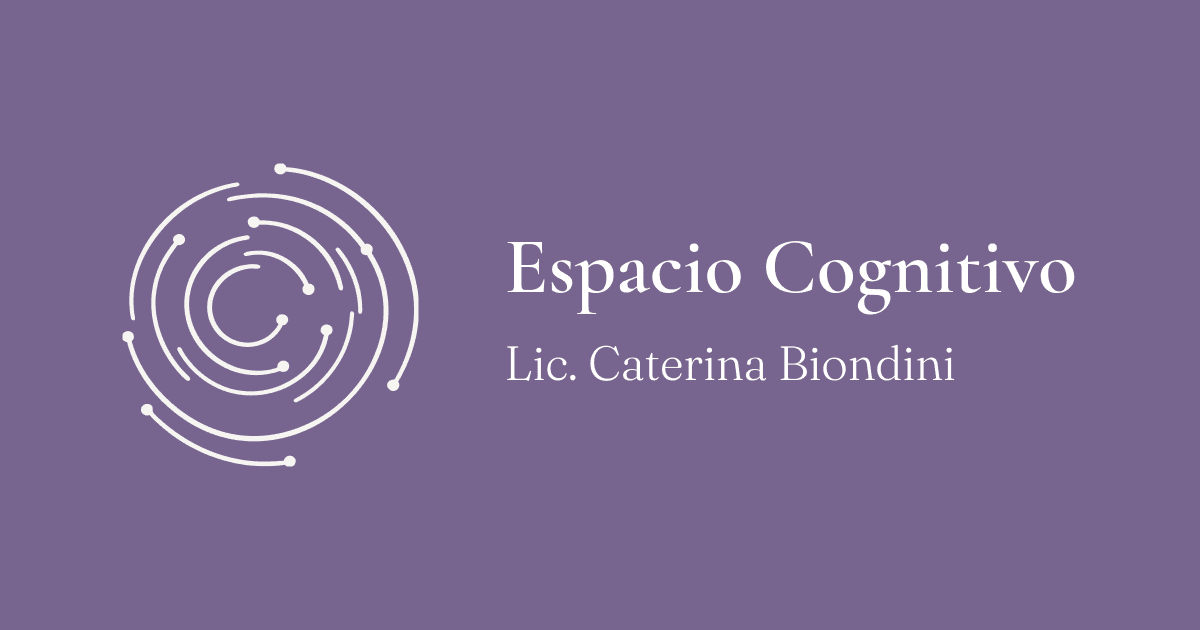
New business identity
The outcome
A clearer and more approachable path towards therapy
Espacio Cognitivo now has a digital presence that communicates Caterina’s work with greater clarity while retaining the warmth and personality behind the practice.
The experience gives prospective patients a clearer understanding of the services available, what therapy may involve and who they will be working with, helping make the path towards first contact feel more predictable and approachable.
Desktop version


Mobile version